Custom Colors. Detailed Illustration. Flawless Execution Across 12 Unique SKUs.
The Challenge
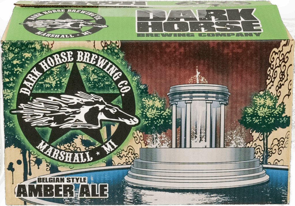
New Holland Brewing’s Dark Horse line arrived at a time when the craft beer scene was booming and packaging had to be just as bold as the beer. The challenge? Twelve unique designs, each with vibrant, highly detailed illustrations, all needing to print cleanly on corrugated using a four-color press.
Custom brand colors, complex imagery, and subtle skin tones made the job particularly difficult to separate and print. This was about more than just hitting color targets. It was about delivering design integrity at scale.
The Collaboration
The project came through our trusted box house partners. With craft breweries leaning into high-end artistry, New Holland needed print support that could bring these illustrations to life, without losing clarity or brand consistency.
Our team worked closely with the box house to create a custom solution from the ground up, starting well before the art ever hit the computer.
Our Approach
Test Plate Strategy
We requested the most complex illustrations from the set and compiled them into a custom test sheet. This allowed us to simulate on-press conditions, explore trapping and registration, and identify print limitations upfront.
Custom Color Mixing
Each flavor variant featured its own brand color on a specific panel ring. We ran side-by-side color patches for each—red, green, purple, and more—allowing the client to choose the best option based on how it actually printed on corrugated.
Dot Gain & Edge Management
With a 20% dot gain on corrugated, careful planning was required. Where colored elements like logo rings met background areas, we gave the client visual options: either accept a harder color break, or use men dots for a smoother blend—each with pros and cons.
Skin Tone Precision
One of the standout challenges was reproducing accurate skin tones using CMYK alongside these wild custom colors. The success of this depended on both prepress expertise and tight control over ink values—credit to Rob and the production team for pulling it off.


The Results
Twelve flawless SKUs—each with unique art and color requirements
Zero rejections across separations or print runs
On-brand, visually rich packaging that stood out in the craft beer aisle
Streamlined production, once the test plate was approved it was smooth sailing from first run to last
“This project could’ve gone off the rails with so many variables. Instead, it ran smooth. No remakes. No rejected jobs. Just great print after great print.”
Why It Worked
Proactive testing, smart color planning, and client collaboration at every stage made the difference. Dynamic Dies helped bring creative packaging to life without compromise.
Have a Complex Design Challenge? We’re Built for It.
When your packaging pushes the limits, we help you print with confidence. From craft beer to high-end consumer goods, we make even the most demanding jobs feel seamless.
Let’s talk about your next project—we’ll bring the strategy and the science.